Olist eCommerce Data Visualization
This is a Refocus Final Task. As a data analyst consultant for an e-commerce company in Brazil, I have been tasked with analyzing their operational performance using a dataset of 100,000 orders from various marketplaces between 2016 and 2018. The report I am required to produce will consist of three main parts: a general dashboard, delivery performance, and product quality. The dataset contains information on customer location, product attributes, order status, price, payment, and freight performance. Additionally, customer reviews and a geolocation dataset linking Brazilian zip codes to latitude/longitude coordinates are available. The report's findings will influence the company's management decisions regarding future business development. The dataset is commercially sensitive and has been anonymized.
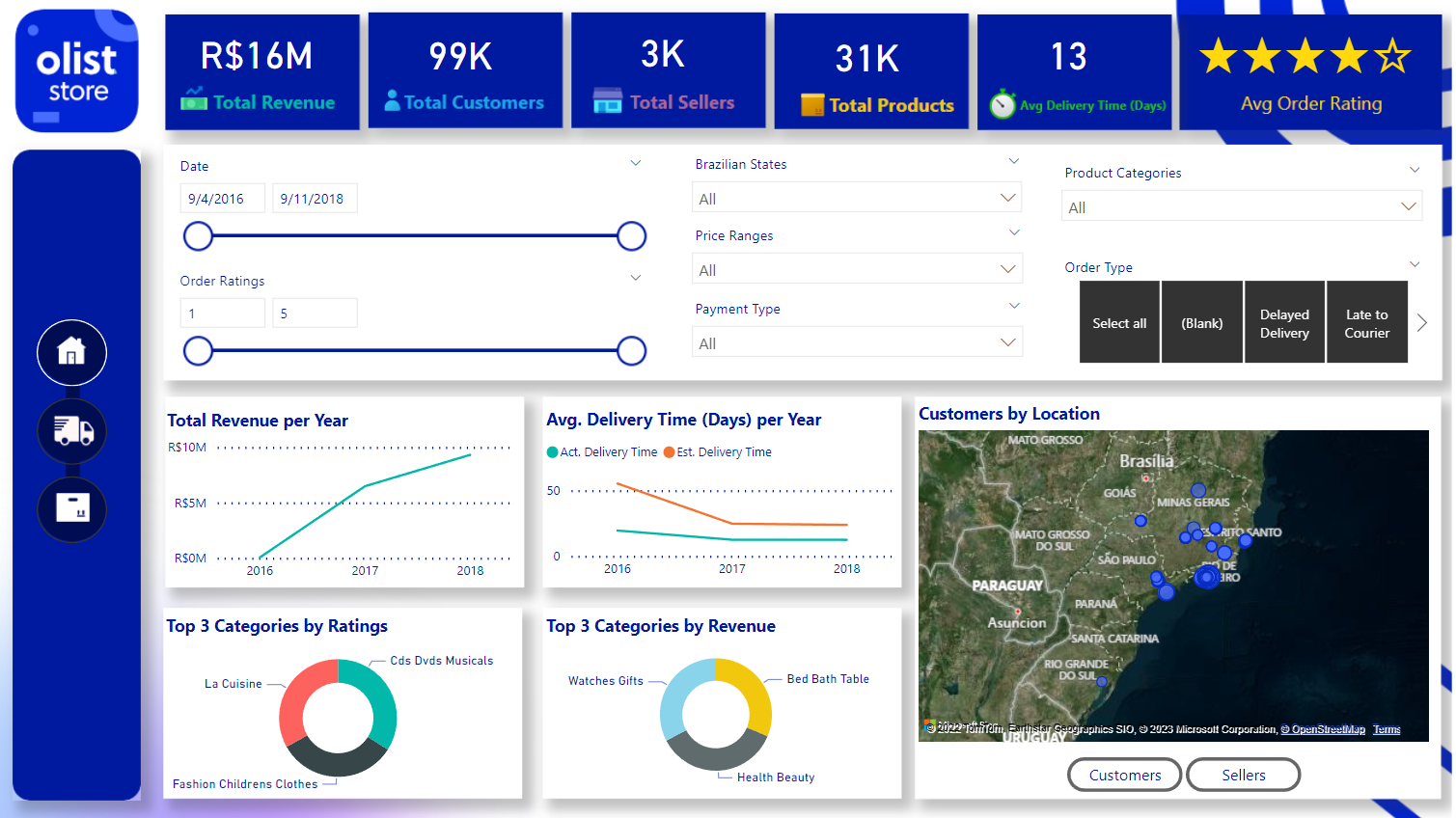
General Dashboard
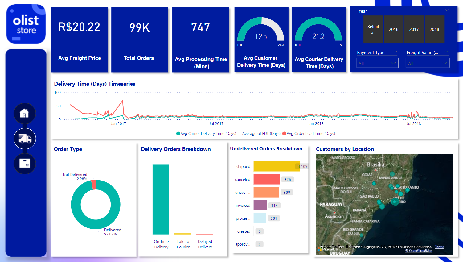
Delivery Performance Dashboard
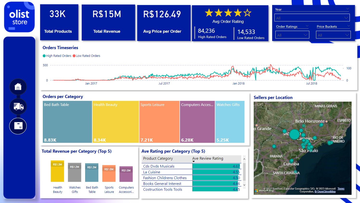
Product Quality Dashboard
Business Objectives
The general dashboard will be established after the business metrics of delivery performance and product quality are planned out. The following bullet points and its sequence are part of my thought process before creating the dashboards:
Delivery Performance
Key metrics:Average freight cost per order Total Orders or Deliveries Average delivery/processing time Average Customer Delivery Time Average Courier Delivery Time
Product Quality
Key metricsTotal Number of Products Total Revenue Average Price per Order Average Review Rating No. of Orders that rated 4-5 stars No. of Orders that rated 1-3 stars
General Dashboard
Key metricsMethodology
Data Cleaning & Processing
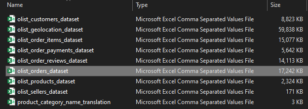
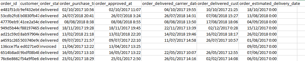
There are nine (9) datasets. Above is a sample of only the Fact Table which is titled "olist_orders_dataset". Upon reviewing the dataset in Excel, I have determined the necessary metrics for the analysis. Utilizing the "ids" column, I will generate a "OrderCount" metric, while the order dates will form the basis of a timeseries graph for the delivery dashboard. Almost all the columns were used in this project. However, the usual data cleaning such as removing duplicate rows, replace null to "No Data", promoting headers, adding measures (ex. Order Lead Time and Dates), and creating buckets were done as part of the processing of data. I also renamed the Dimension Tables and Fact Tables accordingly for easy data modeling.
Data Modeling

Above shows the data modeling schema I used, which is called a snowflake schema. I used Many-To-One for all entity-relationship diagrams (ERD).
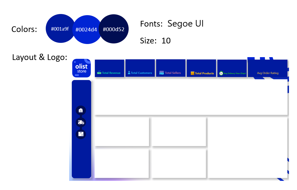
Dashboard Design
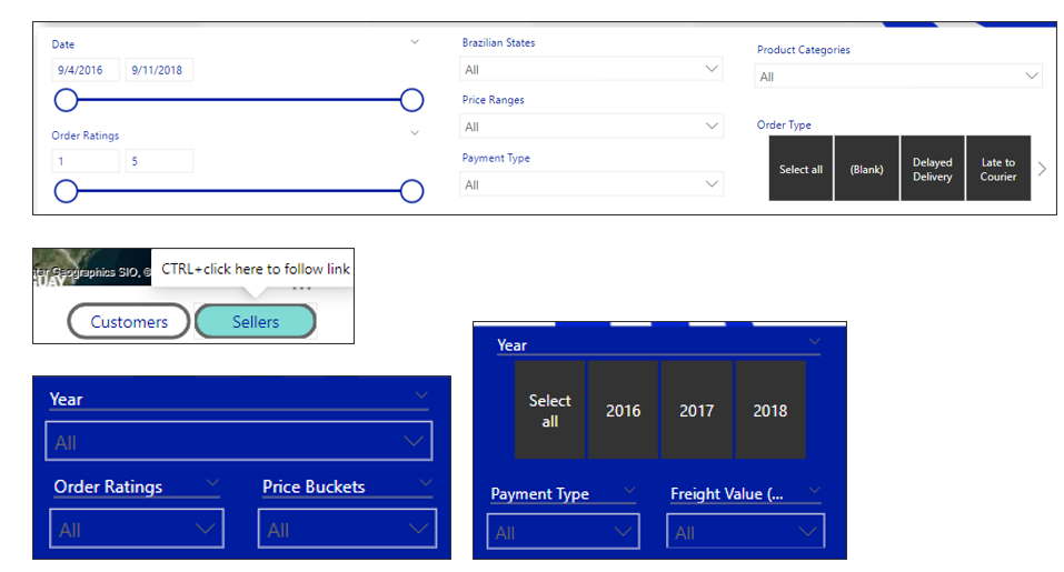
Below shows the visual elements in Power BI and the fields assigned to them.
Layout
Graphs & Cards
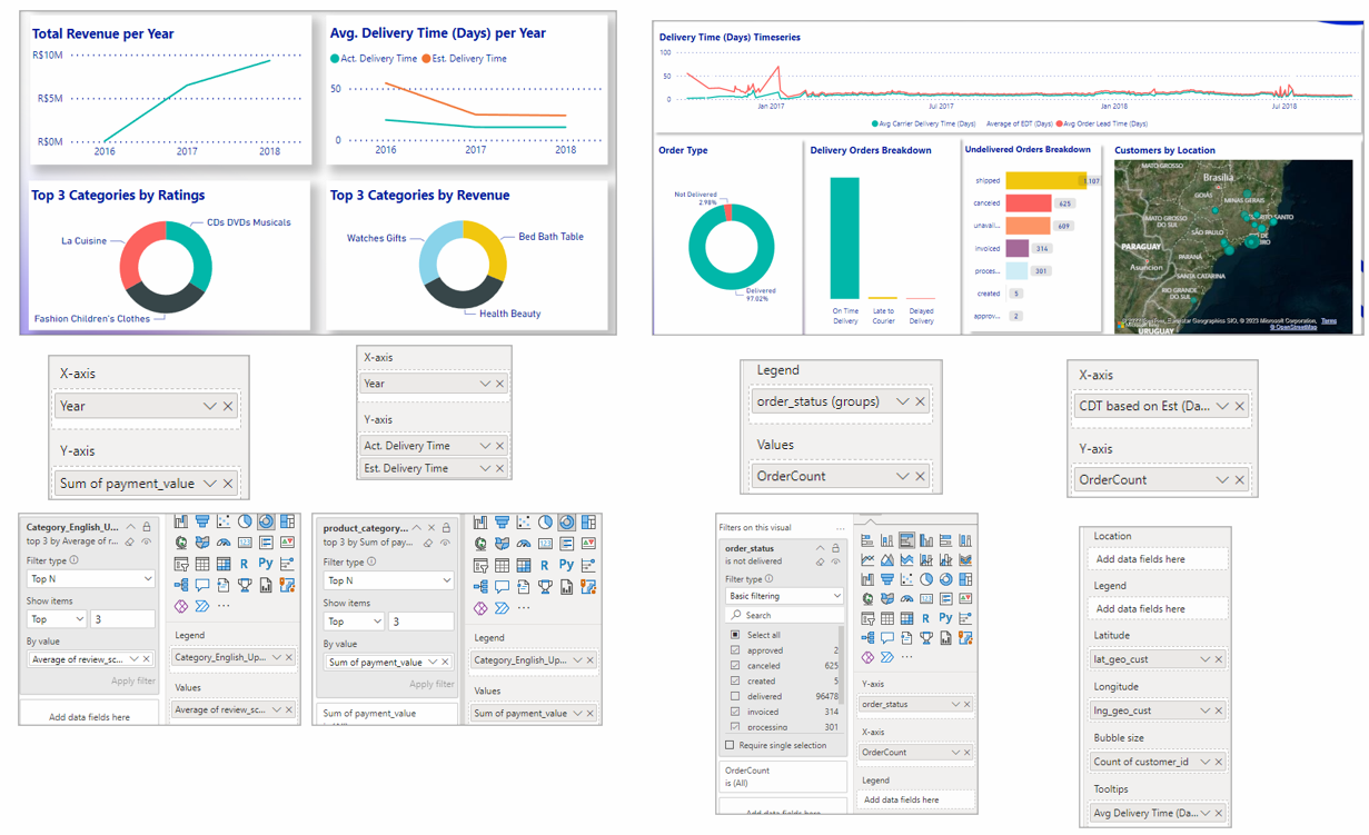
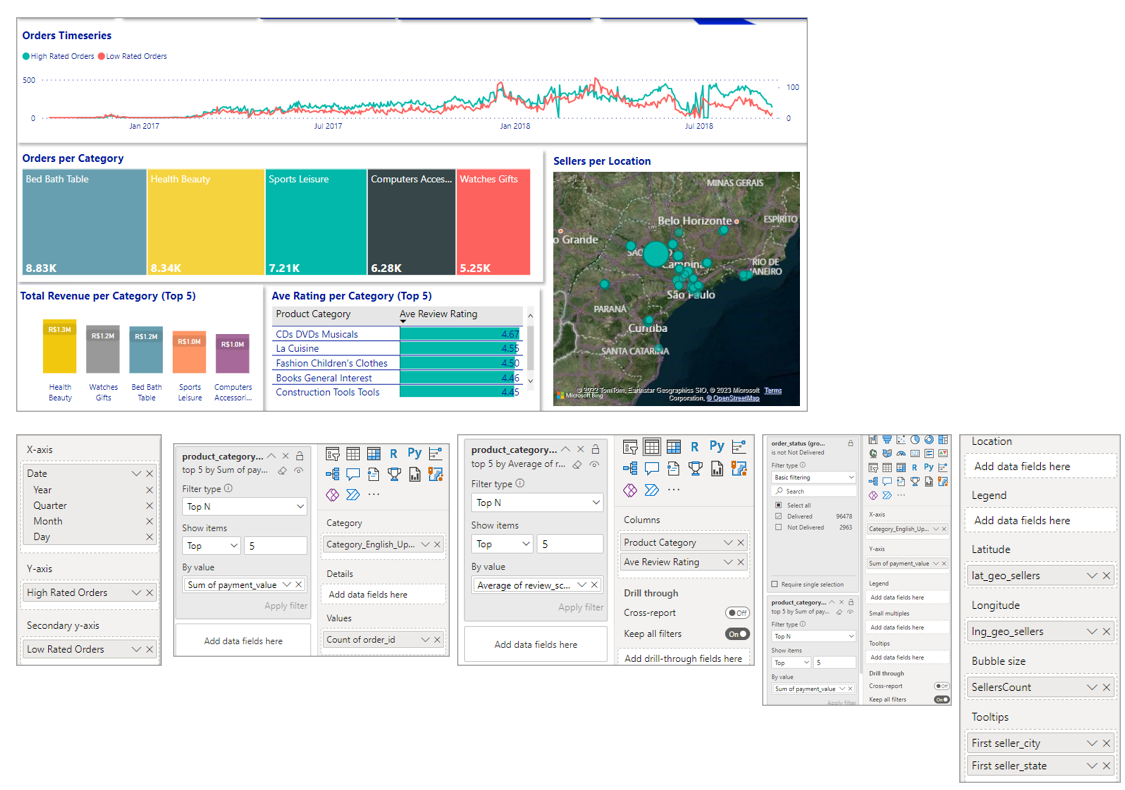
Filters